<!DOCTYPE html>
<html lang="en">
<head>
    <meta charset="UTF-8">
    <meta name="viewport" content="width=device-width, initial-scale=1.0">
        <title>Warrior-mentor - Boost Your Online Sales with Our Powerful eCommerce Tools</title>

    <script src="https://cdn.tailwindcss.com"></script>
    
    <link href="https://cdnjs.cloudflare.com/ajax/libs/flowbite/2.2.0/flowbite.min.css" rel="stylesheet" />
    <link rel="stylesheet" href="https://cdnjs.cloudflare.com/ajax/libs/font-awesome/6.4.0/css/all.min.css">
    <link rel="preconnect" href="https://fonts.googleapis.com">
    <link rel="preconnect" href="https://fonts.gstatic.com" crossorigin>
    <link href="https://fonts.googleapis.com/css2?family=Inter:wght@300;400;500;600;700;800;900&family=Plus+Jakarta+Sans:wght@300;400;500;600;700;800;900&display=swap" rel="stylesheet">

    <style>
        html {
            scroll-behavior: smooth;
        }

        body {
            font-family: 'Inter', sans-serif;
        }
        h1, h2, h3, h4, h5, h6 {
            font-family: 'Plus Jakarta Sans', sans-serif;
        }

        .gradient-text {
            background: linear-gradient(135deg, var(--tw-gradient-from), var(--tw-gradient-to));
            -webkit-background-clip: text;
            -webkit-text-fill-color: transparent;
            background-clip: text;
        }

        .glass-effect {
            background: rgba(255, 255, 255, 0.9);
            backdrop-filter: blur(10px);
            -webkit-backdrop-filter: blur(10px);
        }

        .hover-lift {
            transition: transform 0.3s ease, box-shadow 0.3s ease;
        }

        .hover-lift:hover {
            transform: translateY(-8px);
            box-shadow: 0 20px 40px rgba(0, 0, 0, 0.15);
        }

        @keyframes float {
            0%, 100% { transform: translateY(0); }
            50% { transform: translateY(-20px); }
        }

        .animate-float {
            animation: float 6s ease-in-out infinite;
        }

        .pattern-dots {
            background-image: radial-gradient(circle, rgba(0,0,0,0.05) 1px, transparent 1px);
            background-size: 20px 20px;
        }

        .section-divider {
            position: relative;
            overflow: hidden;
        }

        .section-divider::before {
            content: '';
            position: absolute;
            top: -50%;
            left: -10%;
            width: 120%;
            height: 200%;
            background: linear-gradient(135deg, transparent 45%, rgba(255,255,255,0.03) 50%, transparent 55%);
            transform: rotate(-5deg);
        }
    </style>
    <link rel="stylesheet" href="assets/css/dynamic.css">
</head>
<body class="antialiased">

<nav class="fixed w-full z-50 top-0 bg-gradient-to-r from-red-600 to-orange-600 text-white shadow-lg">
    <div class="max-w-screen-xl flex flex-wrap items-center justify-between mx-auto p-4">
        <a href="./" class="flex items-center space-x-3">
            <div class="w-10 h-10 bg-white/20 backdrop-blur-sm rounded-lg flex items-center justify-center">
                <svg width="48" height="48" viewBox="0 0 48 48" xmlns="http://www.w3.org/2000/svg">
                <defs>
                    <linearGradient id="grad-599dd9f30b7216379b068968dbc3874b" x1="0%" y1="0%" x2="100%" y2="100%">
                        <stop offset="0%" style="stop-color:#ef4444;stop-opacity:1" />
                        <stop offset="100%" style="stop-color:#ea580c;stop-opacity:1" />
                    </linearGradient>
                </defs>
                <path d="M 24 2 Q 24 2 24 14 L 46 44 Q 24 44 2 46 Z" fill="url(#grad-599dd9f30b7216379b068968dbc3874b)" />
                <text x="24" y="29" font-family="Arial, sans-serif" font-size="16" font-weight="bold" fill="white" text-anchor="middle" dominant-baseline="central">WA</text>
            </svg>            </div>
            <span class="self-center text-2xl font-bold">
                Warrior-mentor            </span>
        </a>
        <button data-collapse-toggle="navbar-default" type="button" class="inline-flex items-center p-2 w-10 h-10 justify-center text-sm text-white rounded-lg md:hidden hover:bg-white/20">
            <svg class="w-5 h-5" fill="none" viewBox="0 0 17 14">
                <path stroke="currentColor" stroke-linecap="round" stroke-linejoin="round" stroke-width="2" d="M1 1h15M1 7h15M1 13h15"/>
            </svg>
        </button>
        <div class="hidden w-full md:block md:w-auto" id="navbar-default">
            <ul class="font-medium flex flex-col md:flex-row md:space-x-6">
                <li><a href="/Home</a></li>
                <li><a href="./about-us.php" class="block py-2 px-3 text-white/90 hover:text-white transition-colors">About</a></li>
                <li><a href="blog/" class="block py-2 px-3 text-white/90 hover:text-white transition-colors">Blog</a></li>
                <li>
                    <a href="./contact.php" class="block py-2 px-6 text-red-600 bg-white rounded-full hover:bg-gray-100 transition-all font-bold">Contact</a>
                </li>
            </ul>
        </div>
    </div>
</nav>


<section class="relative mt-16 bg-gray-900 overflow-hidden">
    <div class="absolute inset-0 bg-gradient-to-br from-red-900/30 to-orange-900/30"></div>
    <div class="absolute inset-0 opacity-5" style="background-image: url('data:image/svg+xml,%3Csvg width=\'60\' height=\'60\' viewBox=\'0 0 60 60\' xmlns=\'http://www.w3.org/2000/svg\'%3E%3Cg fill=\'none\' fill-rule=\'evenodd\'%3E%3Cg fill=\'%23ffffff\' fill-opacity=\'1\'%3E%3Cpath d=\'M36 34v-4h-2v4h-4v2h4v4h2v-4h4v-2h-4zm0-30V0h-2v4h-4v2h4v4h2V6h4V4h-4zM6 34v-4H4v4H0v2h4v4h2v-4h4v-2H6zM6 4V0H4v4H0v2h4v4h2V6h4V4H6z\'/%3E%3C/g%3E%3C/g%3E%3C/svg%3E');"></div>
    
    <div class="max-w-screen-xl mx-auto px-4 py-24 lg:py-32 relative z-10">
        <div class="text-center max-w-4xl mx-auto mb-16">
            <div class="inline-block px-5 py-2 mb-6 bg-white/10 backdrop-blur-sm text-white rounded-full text-sm font-semibold border border-white/20">
                Performance Enhancers            </div>
            
            <h1 class="text-4xl md:text-5xl lg:text-6xl font-black text-white mb-6 uppercase tracking-tight">
                Boost Your Online Sales with Our Powerful eCommerce Tools            </h1>
            
            <p class="text-xl text-gray-300 mb-10">
                Get access to the top eCommerce tools you need to succeed online.            </p>
            
            <div class="flex flex-col sm:flex-row gap-4 justify-center">
                <a href="#contact" class="px-8 py-4 bg-gradient-to-r from-red-600 to-orange-600 text-white font-bold rounded-lg hover:shadow-2xl transition-all text-lg">
                    Revolutionize Your Strategies Now →
                </a>
                <a href="#services" class="px-8 py-4 bg-white/10 backdrop-blur-sm text-white font-bold rounded-lg border-2 border-white/20 hover:bg-white/20 transition-all text-lg">
                    Explore Services
                </a>
            </div>
        </div>
    </div>
</section>


<section class="py-20 bg-gradient-to-r from-red-50 via-white to-orange-50">
    <div class="max-w-screen-xl mx-auto px-4">
        <div class="flex flex-wrap justify-around items-center gap-8">
            <div class="text-center min-w-[200px]">
                <div class="text-5xl font-black bg-gradient-to-r from-red-600 to-orange-600 bg-clip-text text-transparent mb-2">500+</div>
                <div class="text-gray-600 font-semibold">Happy Clients</div>
                <div class="h-1 w-16 bg-gradient-to-r from-red-600 to-orange-600 mx-auto mt-3"></div>
            </div>
            <div class="text-center min-w-[200px]">
                <div class="text-5xl font-black bg-gradient-to-r from-red-600 to-orange-600 bg-clip-text text-transparent mb-2">98%</div>
                <div class="text-gray-600 font-semibold">Satisfaction Rate</div>
                <div class="h-1 w-16 bg-gradient-to-r from-red-600 to-orange-600 mx-auto mt-3"></div>
            </div>
            <div class="text-center min-w-[200px]">
                <div class="text-5xl font-black bg-gradient-to-r from-red-600 to-orange-600 bg-clip-text text-transparent mb-2">24/7</div>
                <div class="text-gray-600 font-semibold">Support Available</div>
                <div class="h-1 w-16 bg-gradient-to-r from-red-600 to-orange-600 mx-auto mt-3"></div>
            </div>
            <div class="text-center min-w-[200px]">
                <div class="text-5xl font-black bg-gradient-to-r from-red-600 to-orange-600 bg-clip-text text-transparent mb-2">15+</div>
                <div class="text-gray-600 font-semibold">Years Experience</div>
                <div class="h-1 w-16 bg-gradient-to-r from-red-600 to-orange-600 mx-auto mt-3"></div>
            </div>
        </div>
    </div>
</section>
<section class="relative bg-gray-900 py-20 overflow-hidden" id="services">
    <div class="absolute inset-0 bg-gradient-to-br from-red-900/20 to-orange-900/20"></div>
    
    <div class="max-w-screen-xl mx-auto px-4 relative z-10">
        <div class="text-center mb-16">
            <span class="inline-block px-4 py-2 bg-white/10 text-white rounded-full text-sm font-semibold mb-4">Services</span>
            <h2 class="text-5xl font-extrabold text-white mb-4">Customized Online Marketing Solutions</h2>
            <p class="text-xl text-gray-300 max-w-2xl mx-auto">Professional solutions for every need</p>
        </div>
        
        <div class="grid md:grid-cols-3 gap-6">
                        <div class="bg-white/5 backdrop-blur-sm border border-white/10 rounded-2xl p-8 hover:bg-white/10 transition-all">
                <div class="w-14 h-14 bg-gradient-to-br from-red-500 to-orange-600 rounded-xl flex items-center justify-center mb-6">
                    <i class="fas fa-briefcase text-white text-2xl"></i>
                </div>
                <h3 class="text-xl font-bold text-white mb-3">Community Management</h3>
                <p class="text-gray-300 leading-relaxed">Increase your social media presence and engagement with a targeted strategy.</p>
            </div>
                        <div class="bg-white/5 backdrop-blur-sm border border-white/10 rounded-2xl p-8 hover:bg-white/10 transition-all">
                <div class="w-14 h-14 bg-gradient-to-br from-red-500 to-orange-600 rounded-xl flex items-center justify-center mb-6">
                    <i class="fas fa-chart-line text-white text-2xl"></i>
                </div>
                <h3 class="text-xl font-bold text-white mb-3">SEO</h3>
                <p class="text-gray-300 leading-relaxed">Boost your website’s visibility and ranking on search engines.</p>
            </div>
                        <div class="bg-white/5 backdrop-blur-sm border border-white/10 rounded-2xl p-8 hover:bg-white/10 transition-all">
                <div class="w-14 h-14 bg-gradient-to-br from-red-500 to-orange-600 rounded-xl flex items-center justify-center mb-6">
                    <i class="fas fa-handshake text-white text-2xl"></i>
                </div>
                <h3 class="text-xl font-bold text-white mb-3">Analytics and Reporting </h3>
                <p class="text-gray-300 leading-relaxed">Track and analyze your digital marketing efforts to optimize your strategy and maximize ROI.</p>
            </div>
                        <div class="bg-white/5 backdrop-blur-sm border border-white/10 rounded-2xl p-8 hover:bg-white/10 transition-all">
                <div class="w-14 h-14 bg-gradient-to-br from-red-500 to-orange-600 rounded-xl flex items-center justify-center mb-6">
                    <i class="fas fa-building text-white text-2xl"></i>
                </div>
                <h3 class="text-xl font-bold text-white mb-3">Content Marketing</h3>
                <p class="text-gray-300 leading-relaxed">Create valuable and engaging content to attract and retain your target audience.</p>
            </div>
                        <div class="bg-white/5 backdrop-blur-sm border border-white/10 rounded-2xl p-8 hover:bg-white/10 transition-all">
                <div class="w-14 h-14 bg-gradient-to-br from-red-500 to-orange-600 rounded-xl flex items-center justify-center mb-6">
                    <i class="fas fa-users text-white text-2xl"></i>
                </div>
                <h3 class="text-xl font-bold text-white mb-3">Email Marketing</h3>
                <p class="text-gray-300 leading-relaxed">Build your email list and engage your subscribers with targeted campaigns.</p>
            </div>
                        <div class="bg-white/5 backdrop-blur-sm border border-white/10 rounded-2xl p-8 hover:bg-white/10 transition-all">
                <div class="w-14 h-14 bg-gradient-to-br from-red-500 to-orange-600 rounded-xl flex items-center justify-center mb-6">
                    <i class="fas fa-trophy text-white text-2xl"></i>
                </div>
                <h3 class="text-xl font-bold text-white mb-3">Video Marketing</h3>
                <p class="text-gray-300 leading-relaxed">Use video content to tell your brand story, engage your audience, and drive conversions.</p>
            </div>
                    </div>
    </div>
</section>

<section class="bg-gradient-to-br from-red-50 via-white to-orange-50 py-20" id="testimonials">
    <div class="max-w-screen-xl mx-auto px-4">
        <div class="flex flex-col md:flex-row gap-8">
                        <div class="flex-1">
                <div class="bg-white rounded-2xl shadow-xl p-8 h-full flex flex-col">
                    <div class="text-red-600 text-5xl mb-4">"</div>
                    
                    <p class="text-gray-700 mb-6 flex-1 leading-relaxed">
                        Operational excellence redefined. Our team productivity increased by 45% in six months.                    </p>
                    
                    <div class="border-t pt-6">
                        <div class="flex items-center justify-between">
                            <div class="flex items-center space-x-3">
                                <img src="https://randomuser.me/api/portraits/men/54.jpg" alt="Brandon Clark" class="w-10 h-10 rounded-full bg-gray-100">
                                <div>
                                    <div class="font-bold text-gray-900 text-sm">Brandon Clark</div>
                                    <div class="text-xs text-gray-600">COO</div>
                                </div>
                            </div>
                            <div class="flex">
                                                                <i class="fas fa-star text-yellow-400 text-xs"></i>
                                                                <i class="fas fa-star text-yellow-400 text-xs"></i>
                                                                <i class="fas fa-star text-yellow-400 text-xs"></i>
                                                                <i class="fas fa-star text-yellow-400 text-xs"></i>
                                                                <i class="fas fa-star text-yellow-400 text-xs"></i>
                                                            </div>
                        </div>
                    </div>
                </div>
            </div>
                        <div class="flex-1">
                <div class="bg-white rounded-2xl shadow-xl p-8 h-full flex flex-col">
                    <div class="text-red-600 text-5xl mb-4">"</div>
                    
                    <p class="text-gray-700 mb-6 flex-1 leading-relaxed">
                        ROI was evident within the first quarter. Their business acumen is second to none.                    </p>
                    
                    <div class="border-t pt-6">
                        <div class="flex items-center justify-between">
                            <div class="flex items-center space-x-3">
                                <img src="https://randomuser.me/api/portraits/men/48.jpg" alt="Christopher Lee" class="w-10 h-10 rounded-full bg-gray-100">
                                <div>
                                    <div class="font-bold text-gray-900 text-sm">Christopher Lee</div>
                                    <div class="text-xs text-gray-600">Managing Director</div>
                                </div>
                            </div>
                            <div class="flex">
                                                                <i class="fas fa-star text-yellow-400 text-xs"></i>
                                                                <i class="fas fa-star text-yellow-400 text-xs"></i>
                                                                <i class="fas fa-star text-yellow-400 text-xs"></i>
                                                                <i class="fas fa-star text-yellow-400 text-xs"></i>
                                                                <i class="fas fa-star text-yellow-400 text-xs"></i>
                                                            </div>
                        </div>
                    </div>
                </div>
            </div>
                        <div class="flex-1">
                <div class="bg-white rounded-2xl shadow-xl p-8 h-full flex flex-col">
                    <div class="text-red-600 text-5xl mb-4">"</div>
                    
                    <p class="text-gray-700 mb-6 flex-1 leading-relaxed">
                        Efficiency gains were immediate and substantial. They optimized processes we didn't even know were broken.                    </p>
                    
                    <div class="border-t pt-6">
                        <div class="flex items-center justify-between">
                            <div class="flex items-center space-x-3">
                                <img src="https://randomuser.me/api/portraits/men/1.jpg" alt="Richard Foster" class="w-10 h-10 rounded-full bg-gray-100">
                                <div>
                                    <div class="font-bold text-gray-900 text-sm">Richard Foster</div>
                                    <div class="text-xs text-gray-600">Operations Manager</div>
                                </div>
                            </div>
                            <div class="flex">
                                                                <i class="fas fa-star text-yellow-400 text-xs"></i>
                                                                <i class="fas fa-star text-yellow-400 text-xs"></i>
                                                                <i class="fas fa-star text-yellow-400 text-xs"></i>
                                                                <i class="fas fa-star text-yellow-400 text-xs"></i>
                                                                <i class="fas fa-star text-yellow-400 text-xs"></i>
                                                            </div>
                        </div>
                    </div>
                </div>
            </div>
                    </div>
    </div>
</section>


<section class="py-24 bg-white" id="features">
    <div class="max-w-screen-xl mx-auto px-4">
        <div class="text-center mb-16">
            <div class="flex items-center justify-center gap-3 mb-6">
                <div class="h-1 w-12 bg-gradient-to-r from-red-600 to-orange-600"></div>
                <span class="text-red-600 font-bold text-sm uppercase tracking-wider">
                    Features
                </span>
                <div class="h-1 w-12 bg-gradient-to-r from-orange-600 to-red-600"></div>
            </div>
            <h2 class="text-5xl md:text-6xl font-black text-gray-900 mb-4">Why Choose Us</h2>
            <p class="text-xl text-gray-600 max-w-3xl mx-auto">Everything you need to succeed, all in one place</p>
        </div>
        <div class="grid md:grid-cols-2 gap-8">
                        <div class="relative group">
                <div class="absolute -inset-1 bg-gradient-to-r from-red-600 to-orange-600 rounded-2xl blur opacity-25 group-hover:opacity-75 transition-opacity"></div>
                <div class="relative bg-white rounded-2xl p-8 shadow-lg border-t-4 border-red-500">
                    <div class="flex gap-4">
                        <div class="w-12 h-12 bg-red-100 rounded-xl flex items-center justify-center flex-shrink-0">
                            <i class="fas fa-rocket text-red-600"></i>
                        </div>
                        <div>
                            <h3 class="text-xl font-black text-gray-900 mb-2">Fast Performance</h3>
                            <p class="text-gray-600">Lightning-fast results</p>
                        </div>
                    </div>
                </div>
            </div>
                        <div class="relative group">
                <div class="absolute -inset-1 bg-gradient-to-r from-red-600 to-orange-600 rounded-2xl blur opacity-25 group-hover:opacity-75 transition-opacity"></div>
                <div class="relative bg-white rounded-2xl p-8 shadow-lg border-t-4 border-red-500">
                    <div class="flex gap-4">
                        <div class="w-12 h-12 bg-red-100 rounded-xl flex items-center justify-center flex-shrink-0">
                            <i class="fas fa-shield-alt text-red-600"></i>
                        </div>
                        <div>
                            <h3 class="text-xl font-black text-gray-900 mb-2">Secure & Safe</h3>
                            <p class="text-gray-600">Your data protected</p>
                        </div>
                    </div>
                </div>
            </div>
                        <div class="relative group">
                <div class="absolute -inset-1 bg-gradient-to-r from-red-600 to-orange-600 rounded-2xl blur opacity-25 group-hover:opacity-75 transition-opacity"></div>
                <div class="relative bg-white rounded-2xl p-8 shadow-lg border-t-4 border-red-500">
                    <div class="flex gap-4">
                        <div class="w-12 h-12 bg-red-100 rounded-xl flex items-center justify-center flex-shrink-0">
                            <i class="fas fa-headset text-red-600"></i>
                        </div>
                        <div>
                            <h3 class="text-xl font-black text-gray-900 mb-2">24/7 Support</h3>
                            <p class="text-gray-600">Always here to help</p>
                        </div>
                    </div>
                </div>
            </div>
                        <div class="relative group">
                <div class="absolute -inset-1 bg-gradient-to-r from-red-600 to-orange-600 rounded-2xl blur opacity-25 group-hover:opacity-75 transition-opacity"></div>
                <div class="relative bg-white rounded-2xl p-8 shadow-lg border-t-4 border-red-500">
                    <div class="flex gap-4">
                        <div class="w-12 h-12 bg-red-100 rounded-xl flex items-center justify-center flex-shrink-0">
                            <i class="fas fa-chart-line text-red-600"></i>
                        </div>
                        <div>
                            <h3 class="text-xl font-black text-gray-900 mb-2">Proven Results</h3>
                            <p class="text-gray-600">Track your success</p>
                        </div>
                    </div>
                </div>
            </div>
                    </div>
    </div>
</section>


<section class="relative py-24 bg-white overflow-hidden" id="about">
    <div class="absolute top-0 left-0 w-full h-full opacity-5" style="background-image: url('data:image/svg+xml,%3Csvg width=\'60\' height=\'60\' viewBox=\'0 0 60 60\' xmlns=\'http://www.w3.org/2000/svg\'%3E%3Cg fill=\'none\' fill-rule=\'evenodd\'%3E%3Cg fill=\'%23000000\' fill-opacity=\'1\'%3E%3Cpath d=\'M36 34v-4h-2v4h-4v2h4v4h2v-4h4v-2h-4zm0-30V0h-2v4h-4v2h4v4h2V6h4V4h-4zM6 34v-4H4v4H0v2h4v4h2v-4h4v-2H6zM6 4V0H4v4H0v2h4v4h2V6h4V4H6z\'/%3E%3C/g%3E%3C/g%3E%3C/svg%3E');"></div>
    <div class="max-w-screen-xl mx-auto px-4 relative z-10">
        <div class="grid lg:grid-cols-3 gap-8">
            <div class="lg:col-span-2">
                <div class="flex items-center gap-3 mb-6">
                    <div class="h-1 w-12 bg-gradient-to-r from-red-600 to-orange-600"></div>
                    <span class="text-red-600 font-bold text-sm uppercase tracking-wider">
                        Performance Enhancers                    </span>
                </div>
                <h2 class="text-5xl font-black text-gray-900 mb-6 leading-tight">
                    Drive Sustainable Growth with Our Expert eCommerce Solutions                </h2>
                <p class="text-lg text-gray-600 mb-8 leading-relaxed">
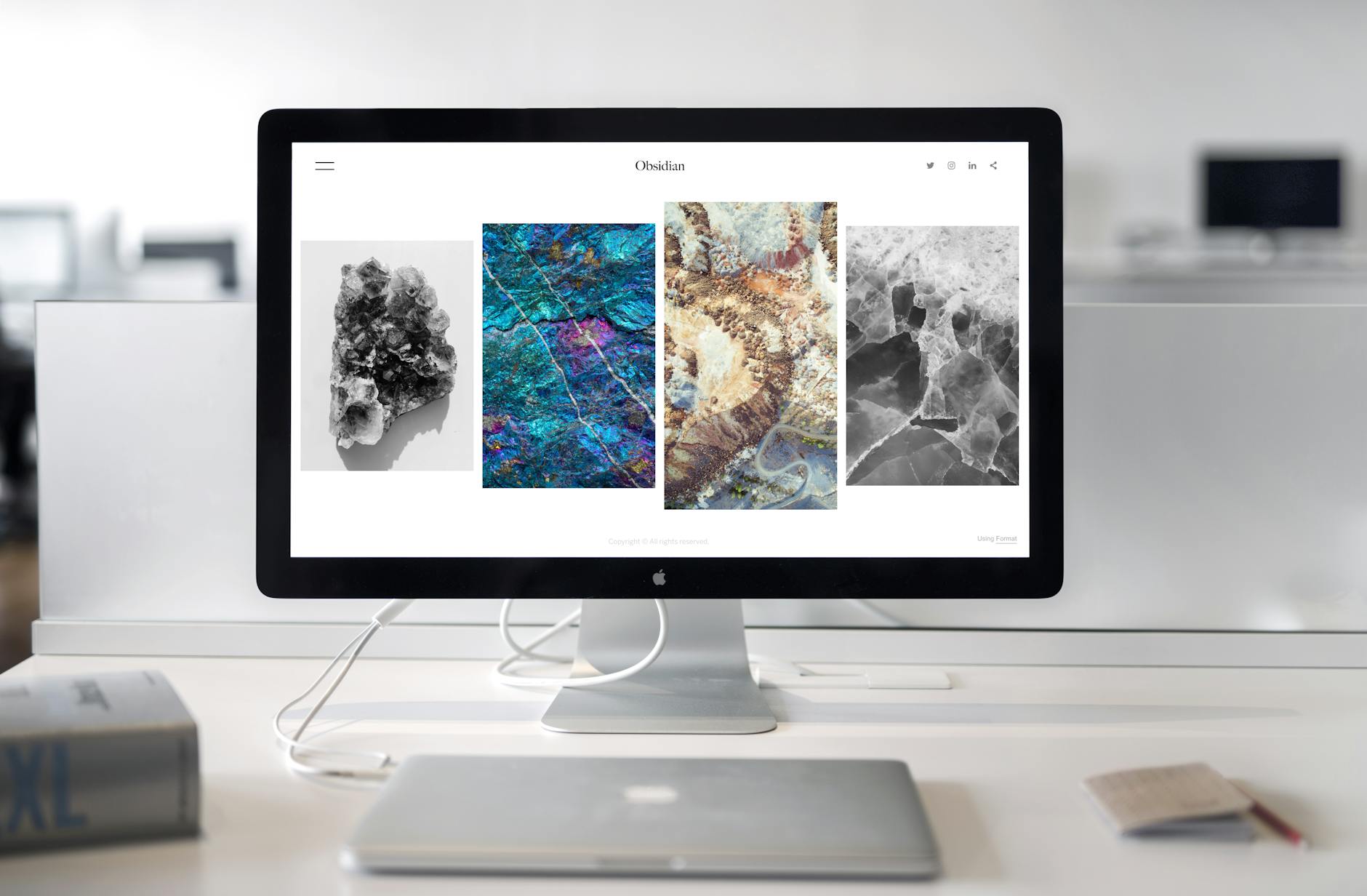
                    Experience the profound impact of as ecommerce experts, we know that understanding your target audience is key to driving sales and revenue. our digital marketing agency offers a range of solutions designed to help you connect with your target customers, from personalized email marketing campaigns to influencer partnerships and more. with our help, you can build lasting relationships with your customers and achieve long-term growth for your business. on your journey.                </p>
                <div class="flex flex-wrap gap-4 mb-8">
                    <div class="px-6 py-3 bg-red-50 rounded-full border border-red-200">
                        <span class="text-red-700 font-semibold">Expert Team</span>
                    </div>
                    <div class="px-6 py-3 bg-orange-50 rounded-full border border-orange-200">
                        <span class="text-orange-700 font-semibold">Proven Results</span>
                    </div>
                    <div class="px-6 py-3 bg-gray-50 rounded-full border border-gray-200">
                        <span class="text-gray-700 font-semibold">Innovation</span>
                    </div>
                </div>
                <a href="#contact" class="group inline-flex items-center gap-3 px-8 py-4 bg-gradient-to-r from-red-600 to-orange-600 text-white font-bold rounded-full hover:shadow-2xl transition-all">
                    Find More Answers                    <i class="fas fa-arrow-right group-hover:translate-x-2 transition-transform"></i>
                </a>
            </div>
            <div class="relative">
                <div class="sticky top-24">
                    <div class="relative">
                        <div class="absolute -inset-4 bg-gradient-to-br from-red-400 to-orange-500 rounded-3xl blur-xl opacity-40"></div>
                        <img src="https://images.pexels.com/photos/1029757/pexels-photo-1029757.jpeg?auto=compress&cs=tinysrgb&dpr=2&h=650&w=940" alt="About" class="relative rounded-3xl shadow-2xl">
                    </div>
                    <div class="mt-6 p-6 bg-gradient-to-br from-red-50 to-orange-50 rounded-2xl border-2 border-red-100">
                        <div class="text-4xl font-black text-red-600 mb-2">98%</div>
                        <div class="text-gray-700 font-semibold">Client Satisfaction</div>
                    </div>
                </div>
            </div>
        </div>
    </div>
</section>


<section class="py-24 bg-white" id="blog">
    <div class="max-w-screen-xl mx-auto px-4">
        <div class="text-center mb-16">
            <div class="inline-block px-6 py-3 bg-red-50 border-2 border-red-200 text-red-700 rounded-lg text-sm font-bold mb-6">
                Blog
            </div>
            <h2 class="text-5xl md:text-6xl font-black text-gray-900">Latest Articles</h2>
        </div>
        <div class="grid md:grid-cols-2 lg:grid-cols-3 gap-6">
                        <article class="group relative bg-white rounded-xl overflow-hidden shadow-lg hover:shadow-2xl transition-all border-t-4 border-red-500">
                <div class="relative h-52 overflow-hidden">
                    <img src="https://images.pexels.com/photos/3184300/pexels-photo-3184300.jpeg?auto=compress&cs=tinysrgb&h=650&w=940" alt="AI-Ready Operating Systems for 2025 Growth" class="w-full h-full object-cover group-hover:scale-110 transition-transform duration-700">
                    <div class="absolute inset-0 bg-gradient-to-t from-black/50 to-transparent"></div>
                    <div class="absolute bottom-4 left-4">
                        <span class="px-3 py-1.5 bg-red-600 text-white text-xs font-bold rounded">Innovation</span>
                    </div>
                </div>
                <div class="p-6">
                    <div class="flex items-center gap-2 mb-3 text-xs text-gray-500">
                        <i class="fas fa-calendar text-red-600"></i>
                        <span>February 10, 2026</span>
                    </div>
                    <h3 class="text-lg font-black text-gray-900 mb-2 group-hover:text-red-600 transition-colors line-clamp-2">
                        <a href="/blog/ai-ready-operating-systems-for-2025-growth/">AI-Ready Operating Systems for 2025 Growth</a>
                    </h3>
                    <p class="text-gray-600 mb-4 leading-relaxed line-clamp-2 text-sm">High-performing operators align AI metrics, modularize processes, and elevate talent to turn automat...</p>
                    <a href="/blog/ai-ready-operating-systems-for-2025-growth/" class="text-red-600 font-semibold text-sm hover:underline inline-flex items-center gap-1">
                        Read more
                        <i class="fas fa-arrow-right text-xs"></i>
                    </a>
                </div>
            </article>
                        <article class="group relative bg-white rounded-xl overflow-hidden shadow-lg hover:shadow-2xl transition-all border-t-4 border-red-500">
                <div class="relative h-52 overflow-hidden">
                    <img src="https://images.pexels.com/photos/3183173/pexels-photo-3183173.jpeg?auto=compress&cs=tinysrgb&h=650&w=940" alt="Resilient Vendor Ecosystems for 2025 Enterprises" class="w-full h-full object-cover group-hover:scale-110 transition-transform duration-700">
                    <div class="absolute inset-0 bg-gradient-to-t from-black/50 to-transparent"></div>
                    <div class="absolute bottom-4 left-4">
                        <span class="px-3 py-1.5 bg-red-600 text-white text-xs font-bold rounded">Operations</span>
                    </div>
                </div>
                <div class="p-6">
                    <div class="flex items-center gap-2 mb-3 text-xs text-gray-500">
                        <i class="fas fa-calendar text-red-600"></i>
                        <span>February 9, 2026</span>
                    </div>
                    <h3 class="text-lg font-black text-gray-900 mb-2 group-hover:text-red-600 transition-colors line-clamp-2">
                        <a href="/blog/resilient-vendor-ecosystems-for-2025-enterprises/">Resilient Vendor Ecosystems for 2025 Enterprises</a>
                    </h3>
                    <p class="text-gray-600 mb-4 leading-relaxed line-clamp-2 text-sm">Vendor ecosystems now include shared telemetry, risk scoring, and joint playbooks so enterprises sta...</p>
                    <a href="/blog/resilient-vendor-ecosystems-for-2025-enterprises/" class="text-red-600 font-semibold text-sm hover:underline inline-flex items-center gap-1">
                        Read more
                        <i class="fas fa-arrow-right text-xs"></i>
                    </a>
                </div>
            </article>
                        <article class="group relative bg-white rounded-xl overflow-hidden shadow-lg hover:shadow-2xl transition-all border-t-4 border-red-500">
                <div class="relative h-52 overflow-hidden">
                    <img src="https://images.pexels.com/photos/3184293/pexels-photo-3184293.jpeg?auto=compress&cs=tinysrgb&h=650&w=940" alt="Revenue PMOs for Subscription Businesses" class="w-full h-full object-cover group-hover:scale-110 transition-transform duration-700">
                    <div class="absolute inset-0 bg-gradient-to-t from-black/50 to-transparent"></div>
                    <div class="absolute bottom-4 left-4">
                        <span class="px-3 py-1.5 bg-red-600 text-white text-xs font-bold rounded">Revenue Operations</span>
                    </div>
                </div>
                <div class="p-6">
                    <div class="flex items-center gap-2 mb-3 text-xs text-gray-500">
                        <i class="fas fa-calendar text-red-600"></i>
                        <span>February 8, 2026</span>
                    </div>
                    <h3 class="text-lg font-black text-gray-900 mb-2 group-hover:text-red-600 transition-colors line-clamp-2">
                        <a href="/blog/revenue-pmos-for-subscription-businesses/">Revenue PMOs for Subscription Businesses</a>
                    </h3>
                    <p class="text-gray-600 mb-4 leading-relaxed line-clamp-2 text-sm">Revenue PMOs orchestrate pricing, packaging, and lifecycle tests so subscription businesses scale pr...</p>
                    <a href="/blog/revenue-pmos-for-subscription-businesses/" class="text-red-600 font-semibold text-sm hover:underline inline-flex items-center gap-1">
                        Read more
                        <i class="fas fa-arrow-right text-xs"></i>
                    </a>
                </div>
            </article>
                    </div>
        <div class="text-center mt-12">
            <a href="blog/" class="inline-flex items-center gap-3 px-10 py-5 bg-gradient-to-r from-red-600 to-orange-600 text-white font-black rounded-xl hover:shadow-2xl transition-all">
                View All Articles
                <i class="fas fa-arrow-right"></i>
            </a>
        </div>
    </div>
</section>


<section class="bg-white py-20">
    <div class="max-w-screen-2xl mx-auto px-4">
        <div class="relative bg-gradient-to-r from-red-600 to-orange-600 rounded-3xl p-16 lg:p-32 text-center overflow-hidden">
            <div class="absolute top-0 right-0 w-96 h-96 bg-white/10 rounded-full -mr-48 -mt-48"></div>
            <div class="absolute bottom-0 left-0 w-96 h-96 bg-black/10 rounded-full -ml-48 -mb-48"></div>
            
            <div class="relative z-10 max-w-4xl mx-auto text-white">
                <h2 class="text-6xl lg:text-8xl font-black mb-8">Ready?</h2>
                <p class="text-3xl font-light mb-12">Let's create something extraordinary together</p>
                <a href="#contact" class="inline-block px-16 py-8 bg-white text-red-600 font-black text-2xl rounded-2xl hover:bg-gray-100 transition-all shadow-2xl">
                    Let's Go →
                </a>
            </div>
        </div>
    </div>
</section>


<section class="bg-gradient-to-br from-gray-50 to-white py-20" id="contact">
    <div class="max-w-screen-md mx-auto px-4">
        <div class="text-center mb-12">
            <div class="inline-block px-4 py-2 mb-4 bg-red-100 text-red-800 rounded-full text-sm font-semibold">
                Get In Touch
            </div>
            <h2 class="text-4xl md:text-5xl font-extrabold text-gray-900 mb-4">Say Hello</h2>
            <p class="text-xl text-gray-600">Fill out the form below and our team will get back to you within 24 hours</p>
        </div>
        
        <form action="#" class="bg-white p-8 md:p-10 rounded-3xl shadow-2xl border border-gray-100">
            <div class="grid md:grid-cols-2 gap-6 mb-6">
                <div>
                    <label for="name" class="block mb-2 text-sm font-semibold text-gray-900">First Name</label>
                    <input type="text" id="name" class="bg-gray-50 border border-gray-300 text-gray-900 rounded-lg focus:ring-red-500 focus:border-red-500 block w-full p-3.5" placeholder="John" required>
                </div>
                <div>
                    <label for="lastname" class="block mb-2 text-sm font-semibold text-gray-900">Last Name</label>
                    <input type="text" id="lastname" class="bg-gray-50 border border-gray-300 text-gray-900 rounded-lg focus:ring-red-500 focus:border-red-500 block w-full p-3.5" placeholder="Doe" required>
                </div>
            </div>
            
            <div class="mb-6">
                <label for="email" class="block mb-2 text-sm font-semibold text-gray-900">Email Address</label>
                <input type="email" id="email" class="bg-gray-50 border border-gray-300 text-gray-900 rounded-lg focus:ring-red-500 focus:border-red-500 block w-full p-3.5" placeholder="john@example.com" required>
            </div>
            
            <div class="mb-6">
                <label for="subject" class="block mb-2 text-sm font-semibold text-gray-900">Subject</label>
                <select id="subject" class="bg-gray-50 border border-gray-300 text-gray-900 rounded-lg focus:ring-red-500 focus:border-red-500 block w-full p-3.5">
                    <option selected>Choose a topic</option>
                    <option value="general">General Inquiry</option>
                    <option value="support">Customer Support</option>
                    <option value="sales">Sales Question</option>
                    <option value="feedback">Feedback</option>
                </select>
            </div>
            
            <div class="mb-6">
                <label for="message" class="block mb-2 text-sm font-semibold text-gray-900">Message</label>
                <textarea id="message" rows="6" class="bg-gray-50 border border-gray-300 text-gray-900 rounded-lg focus:ring-red-500 focus:border-red-500 block w-full p-3.5" placeholder="Your message here..." required></textarea>
            </div>
            
            <button type="submit" class="w-full py-4 text-base font-bold text-white bg-gradient-to-r from-red-600 to-orange-600 rounded-lg hover:shadow-xl transition-all">
                Send Message →
            </button>
        </form>
        
        <div class="grid md:grid-cols-3 gap-6 mt-12 text-center">
            <div class="p-4">
                <div class="w-12 h-12 bg-red-100 rounded-full flex items-center justify-center mx-auto mb-3">
                    <i class="fas fa-phone text-red-600"></i>
                </div>
                <p class="text-sm font-semibold text-gray-900">+1-623-753-7576</p>
            </div>
            <div class="p-4">
                <div class="w-12 h-12 bg-red-100 rounded-full flex items-center justify-center mx-auto mb-3">
                    <i class="fas fa-envelope text-red-600"></i>
                </div>
                <p class="text-sm font-semibold text-gray-900">support@warrior-mentor.com</p>
            </div>
            <div class="p-4">
                <div class="w-12 h-12 bg-red-100 rounded-full flex items-center justify-center mx-auto mb-3">
                    <i class="fas fa-map-marker-alt text-red-600"></i>
                </div>
                <p class="text-sm font-semibold text-gray-900">145 State Street, Milwaukee, WI 53202</p>
            </div>
        </div>
    </div>
</section>


<footer class="bg-white py-16">
    <div class="max-w-screen-xl mx-auto px-4">
        <div class="flex flex-col md:flex-row justify-between items-start mb-12 gap-8">
            <div class="flex-1">
                <a href="./" class="flex items-center space-x-3 mb-6">
                    <div class="w-12 h-12 bg-gradient-to-br from-red-500 to-orange-600 rounded-xl flex items-center justify-center shadow-md">
                        <span class="text-white font-bold text-xl">W</span>
                    </div>
                    <span class="text-2xl font-black text-gray-900">Warrior-mentor</span>
                </a>
                <p class="text-gray-600 mb-6 max-w-sm">Building the future with innovative solutions and dedicated service.</p>
                <div class="flex space-x-3">
                    <a href="#" class="w-10 h-10 bg-red-50 hover:bg-red-600 hover:text-white text-red-600 rounded-lg flex items-center justify-center transition-all">
                        <i class="fab fa-facebook-f"></i>
                    </a>
                    <a href="#" class="w-10 h-10 bg-red-50 hover:bg-red-600 hover:text-white text-red-600 rounded-lg flex items-center justify-center transition-all">
                        <i class="fab fa-twitter"></i>
                    </a>
                    <a href="#" class="w-10 h-10 bg-red-50 hover:bg-red-600 hover:text-white text-red-600 rounded-lg flex items-center justify-center transition-all">
                        <i class="fab fa-linkedin-in"></i>
                    </a>
                    <a href="#" class="w-10 h-10 bg-red-50 hover:bg-red-600 hover:text-white text-red-600 rounded-lg flex items-center justify-center transition-all">
                        <i class="fab fa-instagram"></i>
                    </a>
                </div>
            </div>
            <div class="grid grid-cols-2 md:grid-cols-4 gap-8 flex-1">
                <div>
                    <h3 class="text-sm font-bold mb-4 text-gray-900 uppercase tracking-wider">Company</h3>
                    <ul class="space-y-2 text-gray-600">
                        <li><a href="./" class="hover:text-redHome</a></li>
                        <li><a href="./" class="hover:text-red-600 transition-colors text-sm">About</a></li>
                        <li><a href="./contact.php" class="hover:text-red-600 transition-colors text-sm">Contact</a></li>
                    </ul>
                </div>
                <div>
                    <h3 class="text-sm font-bold mb-4 text-gray-900 uppercase tracking-wider">Resources</h3>
                    <ul class="space-y-2 text-gray-600">
                        <li><a href="blog/" class="hover:text-red-600 transition-colors text-sm">Blog</a></li>
                    </ul>
                </div>
                <div>
                    <h3 class="text-sm font-bold mb-4 text-gray-900 uppercase tracking-wider">Legal</h3>
                    <ul class="space-y-2 text-gray-600">
                        <li><a href="./privacy.php" class="hover:text-red-600 transition-colors text-sm">Privacy</a></li>
                        <li><a href="./terms.php" class="hover:text-red-600 transition-colors text-sm">Terms</a></li>
                    </ul>
                </div>
                <div>
                    <h3 class="text-sm font-bold mb-4 text-gray-900 uppercase tracking-wider">Support</h3>
                    <ul class="space-y-2 text-gray-600">
                        <li><a href="./contact.php" class="hover:text-red-600 transition-colors text-sm">Help Center</a></li>
                        <li><a href="./disclaimer.php" class="hover:text-red-600 transition-colors text-sm">Disclaimer</a></li>
                    </ul>
                </div>
            </div>
        </div>
        <div class="border-t border-gray-200 pt-8">
            <p class="text-gray-500 text-sm text-center">© 2026 Warrior-mentor. All rights reserved.</p>
        </div>
    </div>
</footer>


<script src="https://cdnjs.cloudflare.com/ajax/libs/flowbite/2.2.0/flowbite.min.js"></script>

<script>
document.addEventListener('DOMContentLoaded', function() {
    const anchorLinks = document.querySelectorAll('a[href^="#"]');

    anchorLinks.forEach(link => {
        link.addEventListener('click', function(e) {
            const href = this.getAttribute('href');
            if (href === '#' || href === '') return;

            const targetId = href.substring(1);
            const targetElement = document.getElementById(targetId);

            if (targetElement) {
                e.preventDefault();
                const headerOffset = 80;
                const elementPosition = targetElement.getBoundingClientRect().top;
                const offsetPosition = elementPosition + window.pageYOffset - headerOffset;

                window.scrollTo({
                    top: offsetPosition,
                    behavior: 'smooth'
                });
            }
        });
    });
});
</script>

</body>
</html>